
Fascia construction, cable route and viewing distance.
01 / LIGHT THROUGH THE FACE
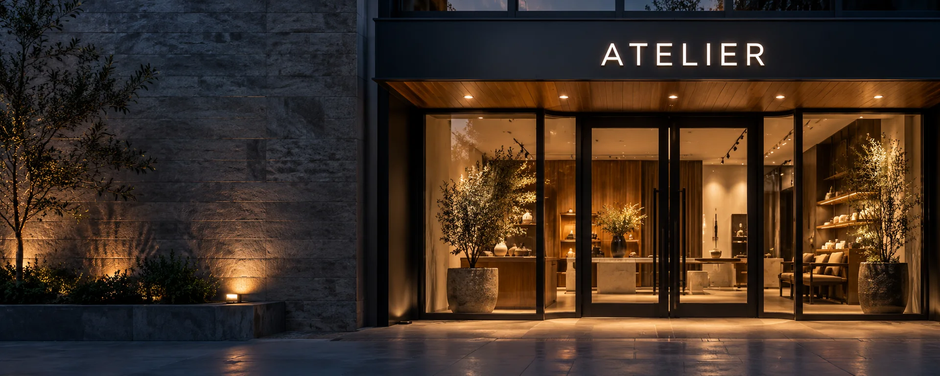
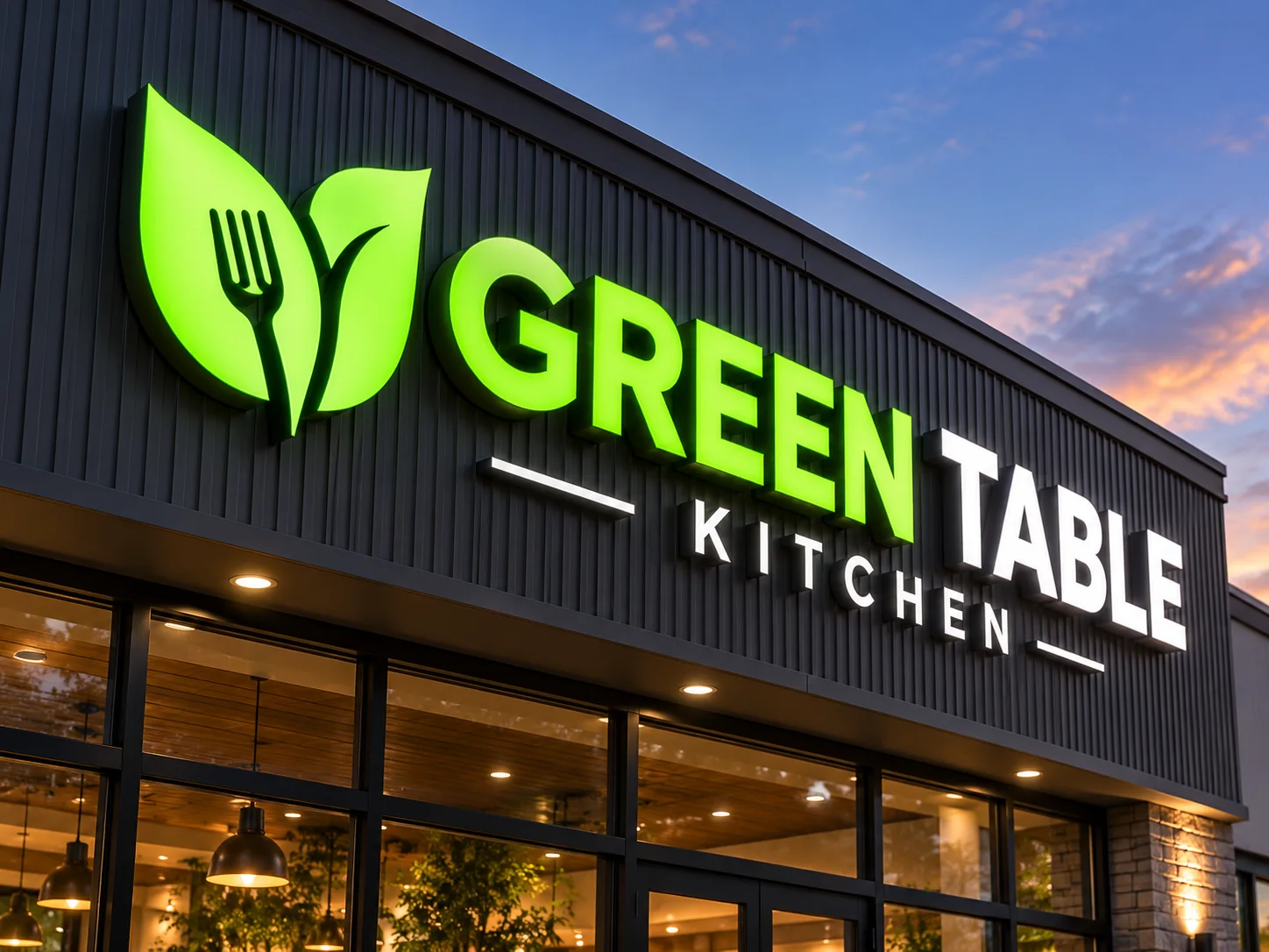
Front-Lit Channel Letters
A defined illuminated face brings your business name into view. A starting point for shopfronts and commercial façades where the lettering needs a clear presence.
- Illuminated letter faces
- Light is directed through the face, with the sides giving each letter its depth.
- Face & return finishes
- Review the face colour, side finish and letter depth around your logo.
- Mounting to suit the frontage
- Discuss individual fixings or a carrier with your installer, along with power and cable access.
Make it yoursLogo, overall size, face colour, return finish and light colour.

Wall finish, stand-off distance and power access.
02 / A GLOW BEHIND THE LETTERING
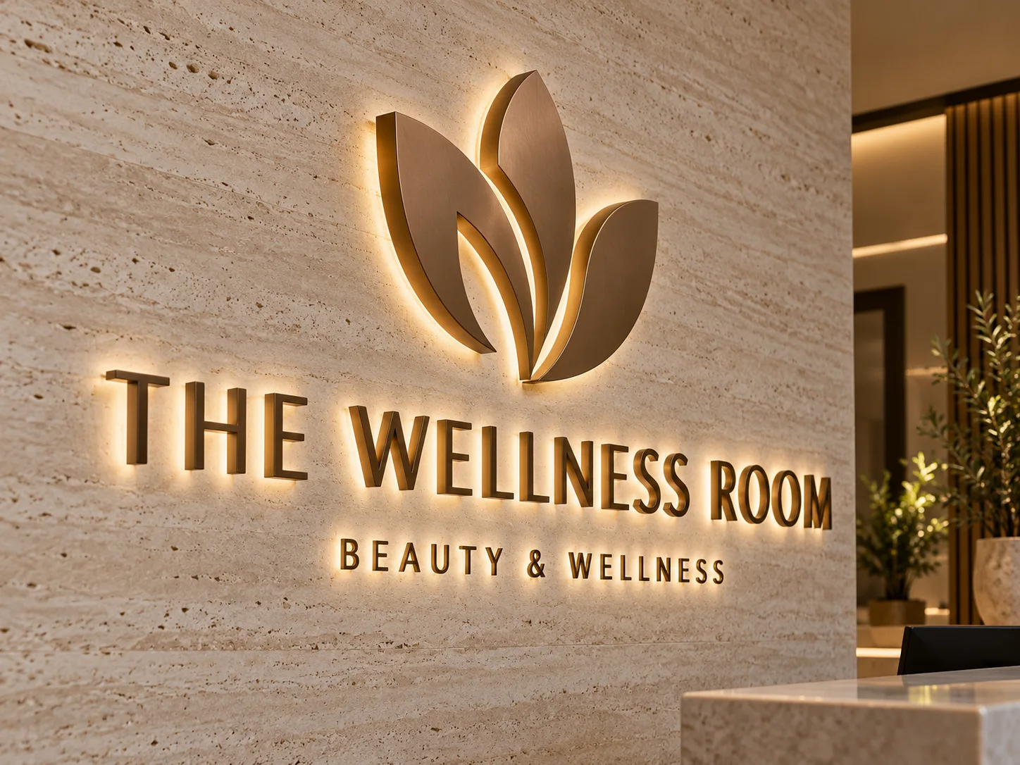
Backlit & Halo-Lit Letters
An opaque face and a halo of light create a softer dimensional effect. The wall becomes part of the appearance, making this a considered choice for brand feature walls.
- Rear illumination
- Light spreads behind the letters while the visible faces remain visually calm.
- Metal face & finish
- Explore brushed, painted or plated appearances against your brand and interior palette.
- The wall shapes the halo
- Wall texture, colour and stand-off distance affect how the glow is seen.
Make it yoursLogo proportions, metal appearance, light colour and wall clearance.
Substrate, exposure, finish and available site light.
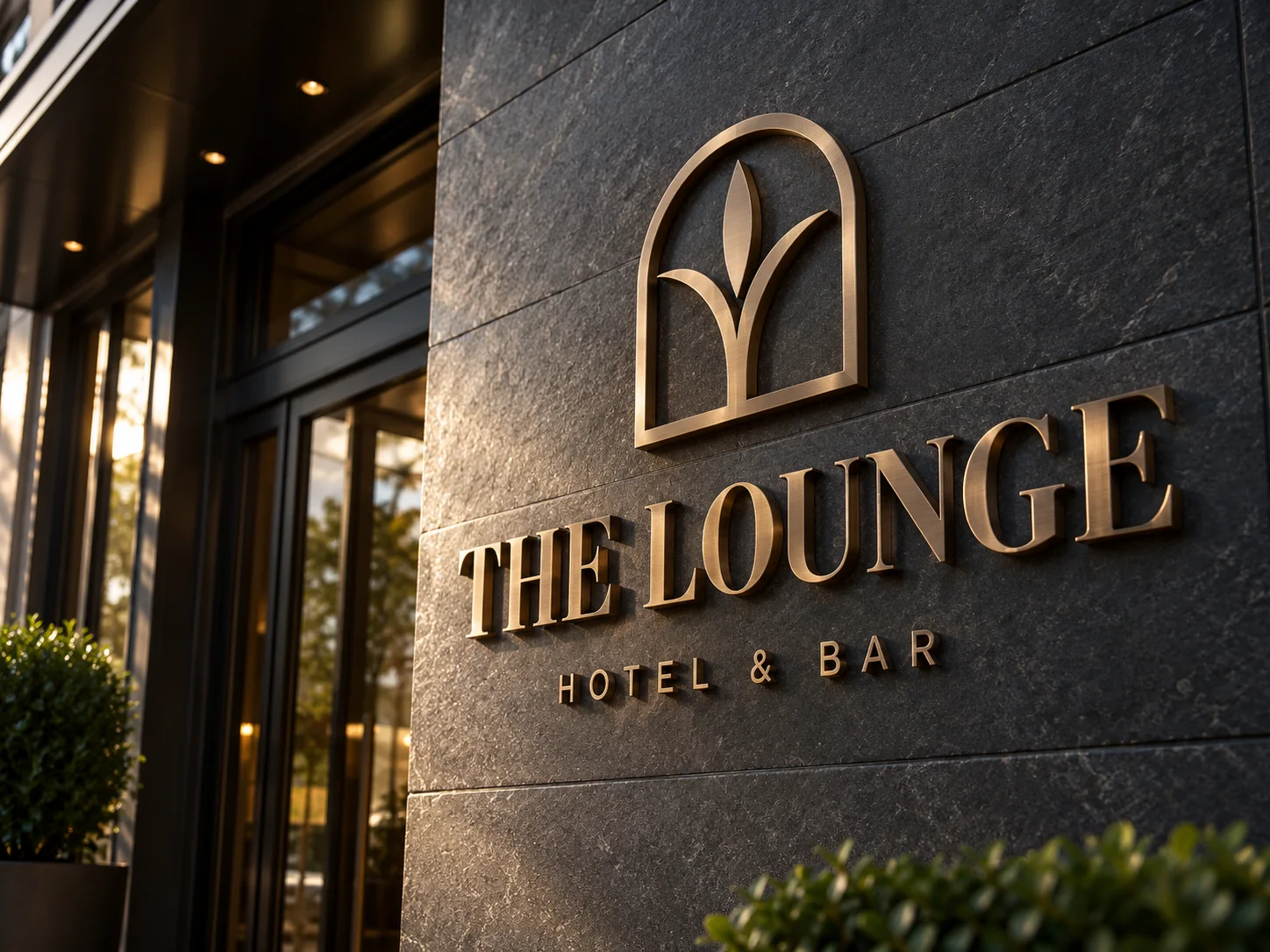
03 / MATERIAL, DEPTH & SHADOW
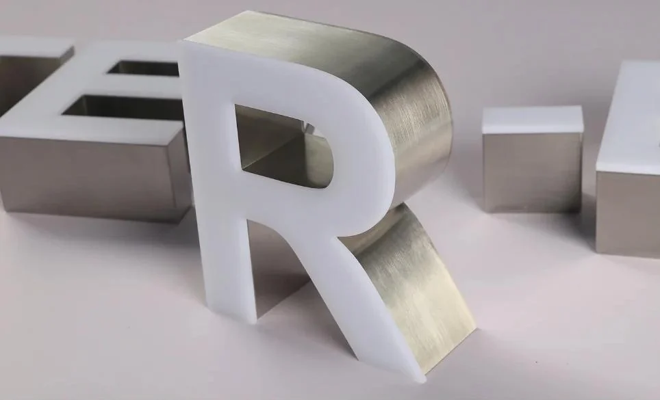
Metal & Dimensional Letters
Let the material do the work. Unlit dimensional lettering brings texture and definition to a wall, with an appearance that changes with the surrounding light.
- Cut or built-up construction
- The artwork and required depth guide the fabrication approach.
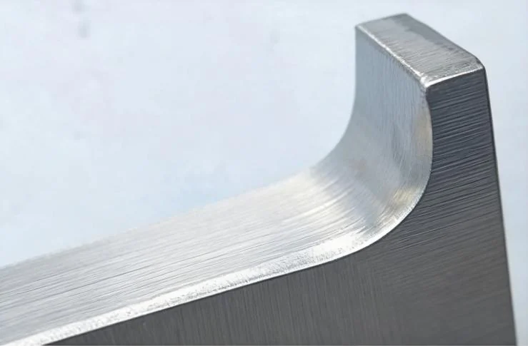
- A finish with character
- Discuss brushed, polished, painted or other available surfaces using a finish reference.
- Dimension without integral light
- The sides and shadows reveal depth; daylight and site lighting remain part of the design.
Make it yoursMetal direction, surface finish, letter depth, size and fixing approach.

Artwork details, thickness, colour and fixing limits.
04 / COLOUR, SHAPE & LAYERS
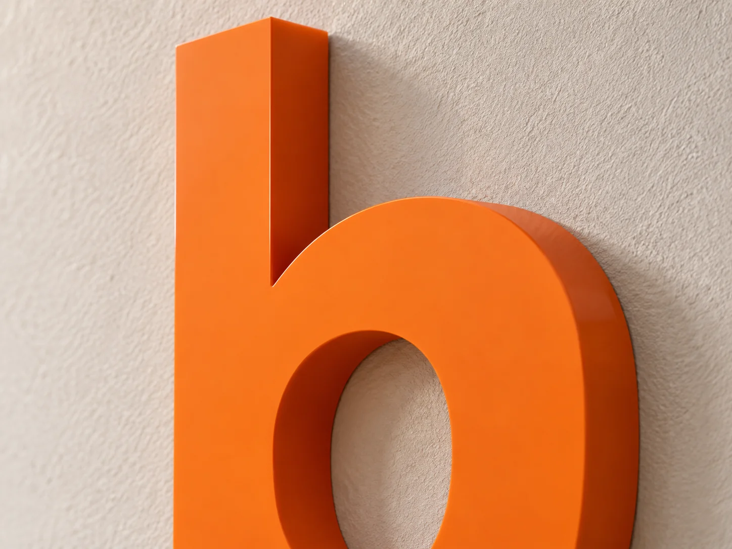
Acrylic Letters & Logo Signs
A clean outline and a deliberate use of colour turn your artwork into a dimensional sign. Explore solid, clear or layered appearances for a distinctive brand wall.
- Colour & transparency
- Review opaque, translucent or clear material directions for the intended effect.
- Depth & layered details
- Thickness, stacked shapes and visible edges give the logo its dimensional character.
- Lighting is a separate choice
- This concept is unlit. If you want illumination, we review a construction designed for that effect.
Make it yoursLogo shape, colour reference, material thickness, layers and mounting.
Viewing direction, bracket, exposure and power.
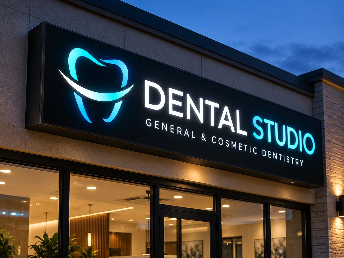
05 / ONE ILLUMINATED FACE
Lightbox Signs
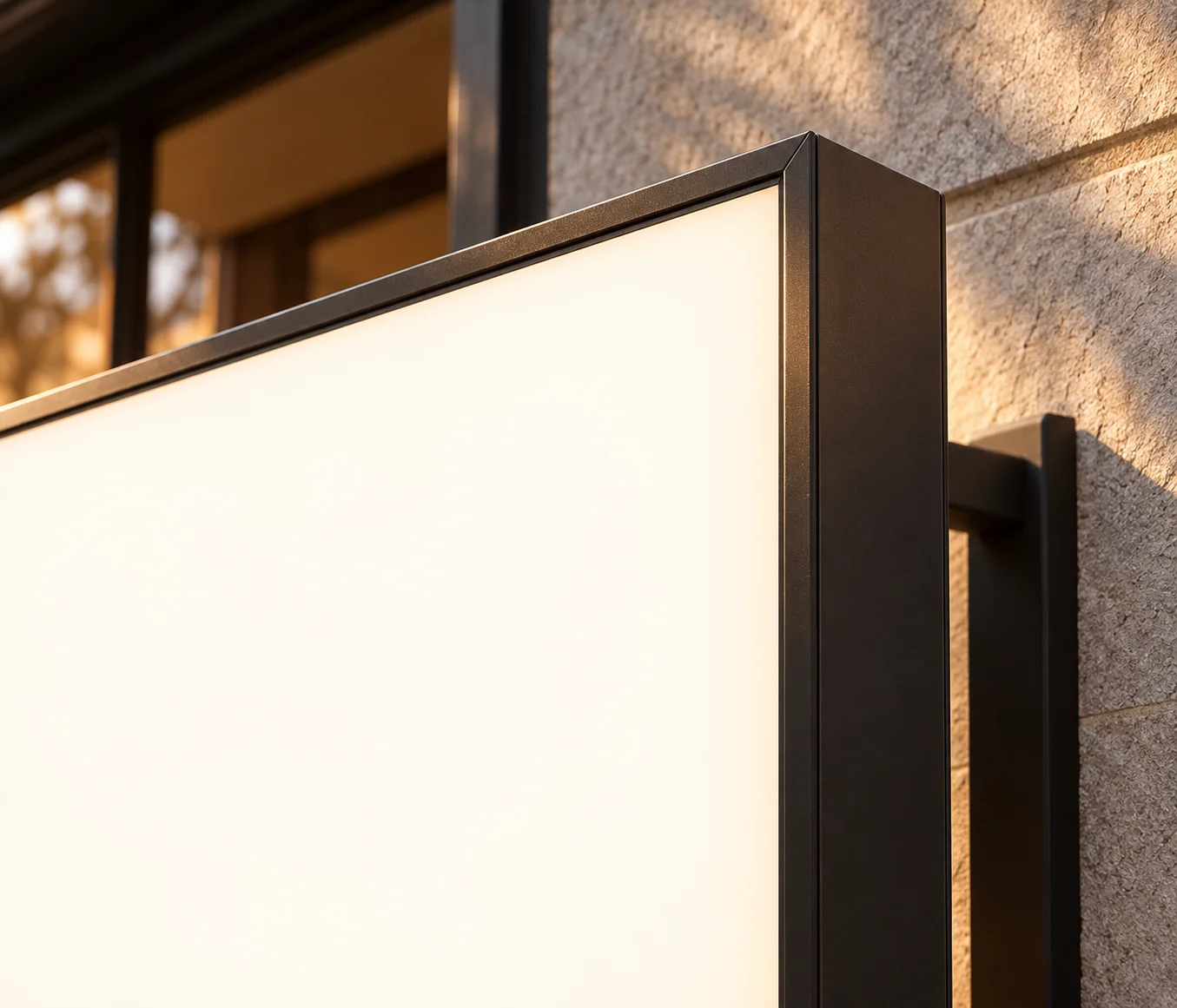
An illuminated panel carries your logo or graphic inside a defined housing. Use the face, shape and viewing direction together when planning a storefront or projecting sign.
- A panel for logos & graphics
- The illuminated face gives the design a continuous display area.
- Single or double-sided direction
- Compare wall-facing and projecting arrangements for the directions people approach from.
- Housing & support
- Review the cabinet depth, frame finish, bracket and local fixing requirements as one assembly.
Make it yoursFace shape, graphics, cabinet finish, overall size and mounting arrangement.
Line geometry, backing, cable exit and location.
06 / LIGHT DRAWN IN LINES
Neon-Style Light Signs
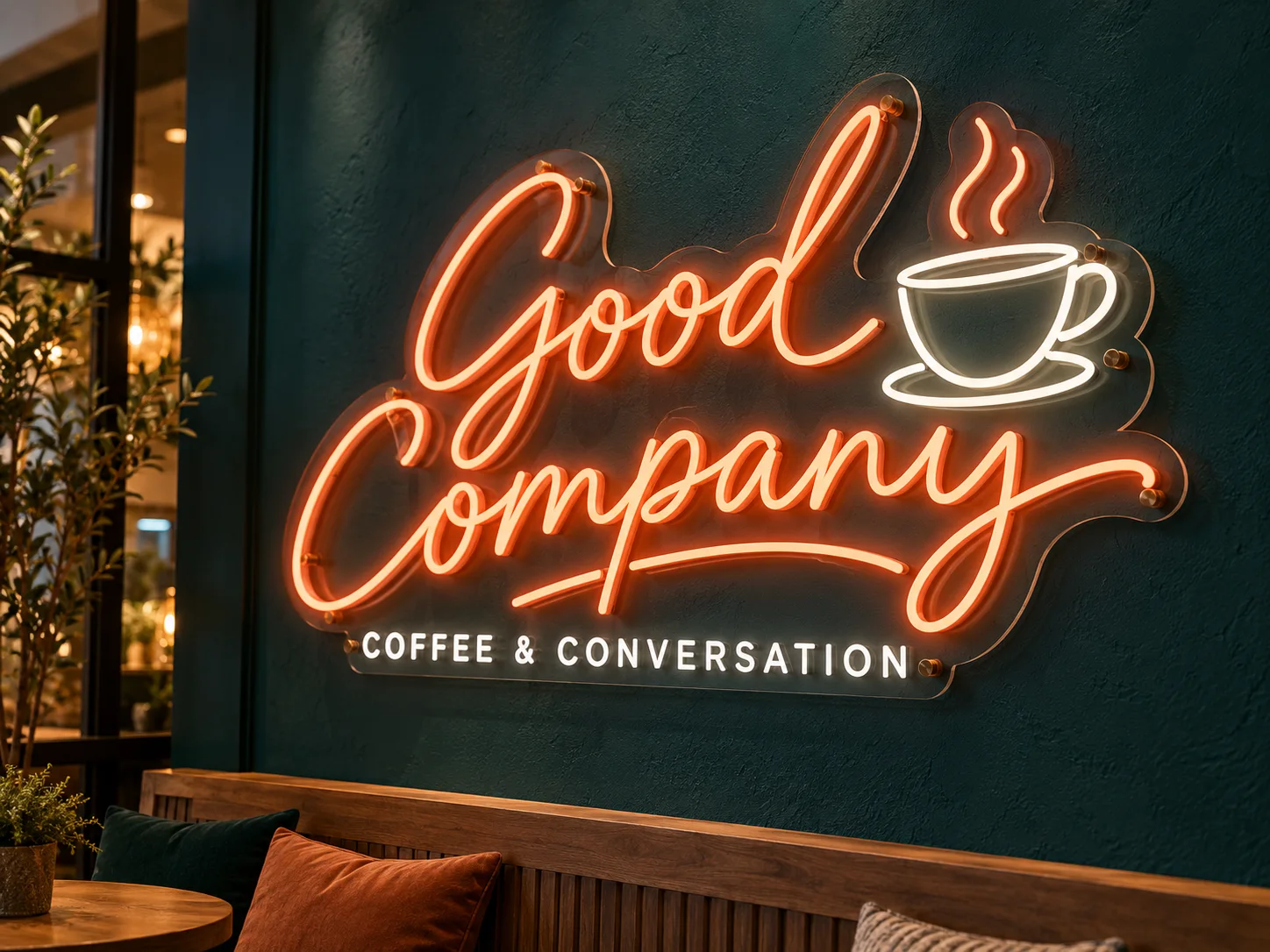
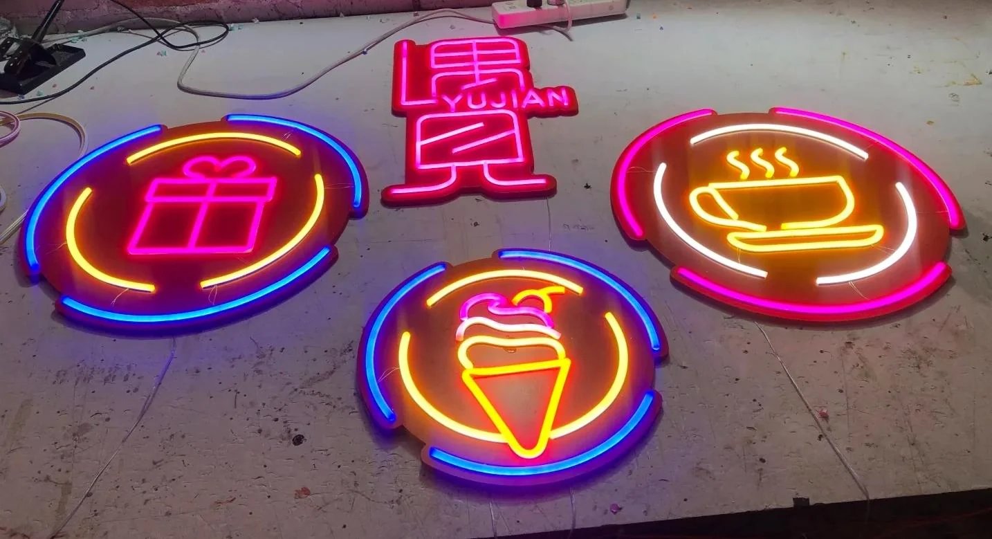
Illuminated lines follow your lettering or graphic to create a focal point. A different direction from a lit panel, suited to expressive wording and simple logo outlines.
- Line-based artwork
- Curves, stroke spacing and small details are reviewed at the intended sign size.
- Light colour & visual rhythm
- Choose the illuminated colour and discuss how separate lines or sections work together.
- Backing & cable arrangement
- Review a clear or coloured backing, visible fixings and the power-supply location.
Make it yoursWording, logo outline, light colour, backing shape and hanging or fixing method.
Construction feasibility, component access and fixing.
07 / A DIFFERENT KIND OF PRESENCE
Specialty Custom Signs
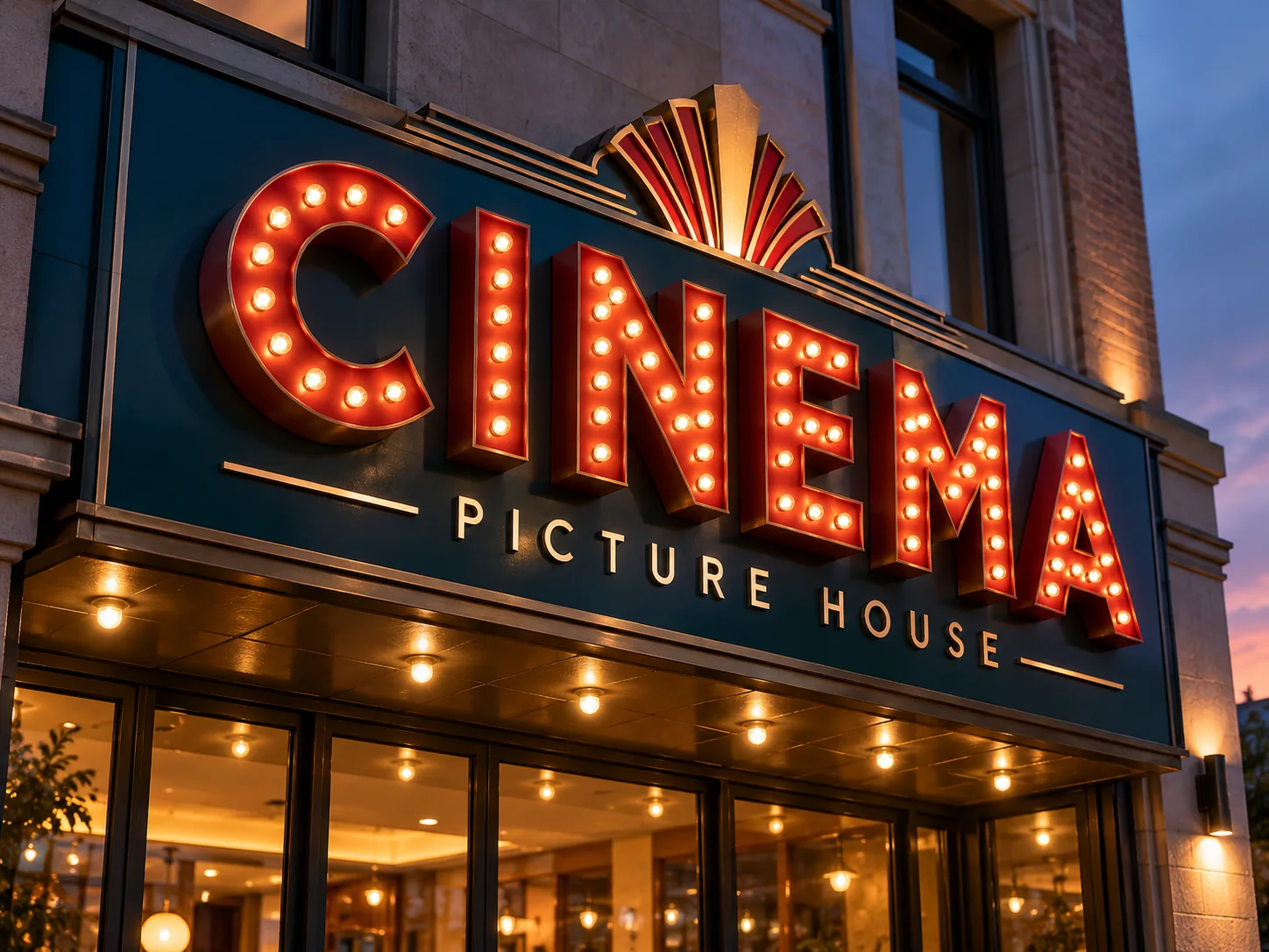
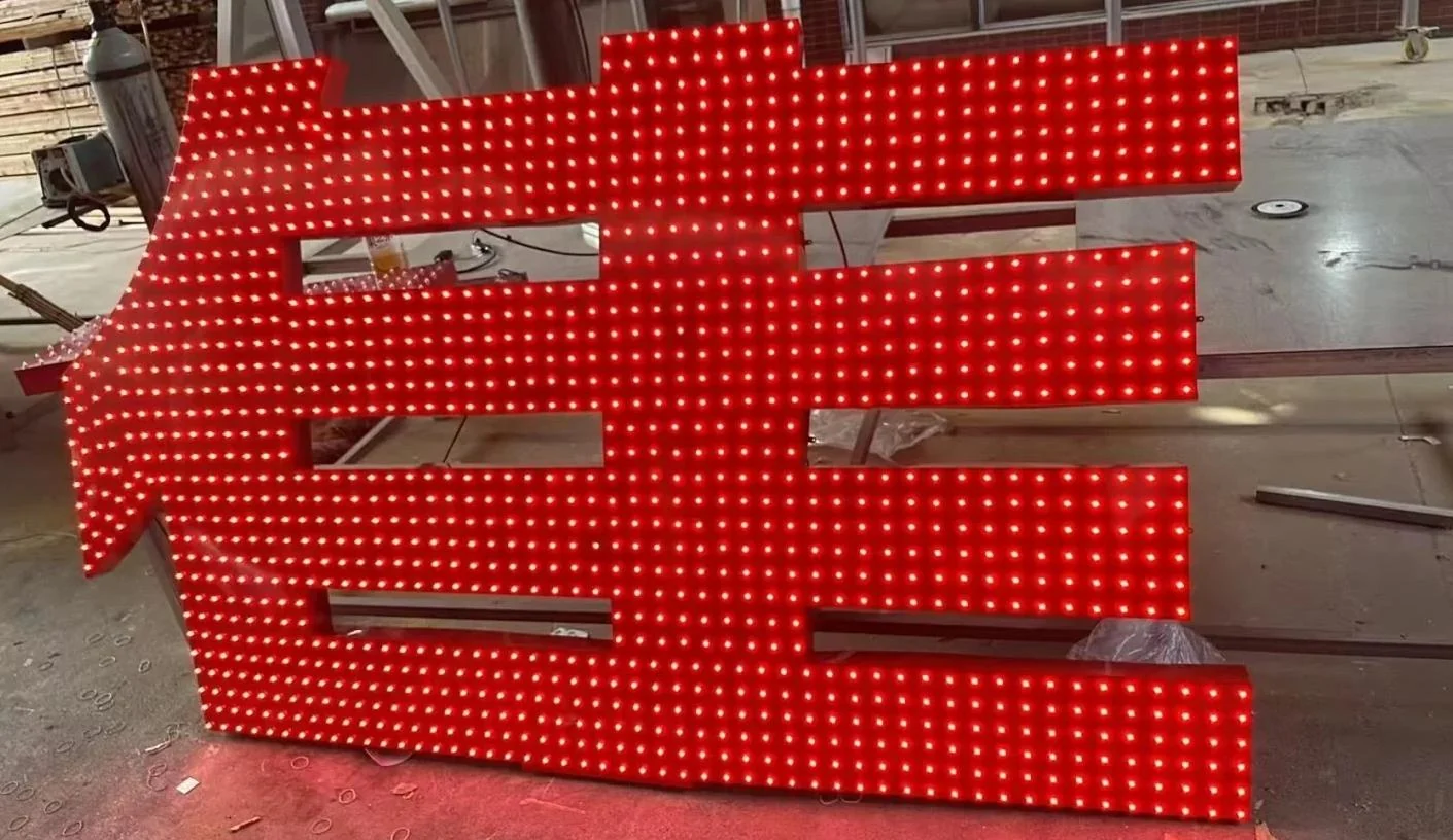
For a reference that does not fit a standard letter style, start with the effect you want. Explore marquee lettering, visible light points and combinations of shape, material and light.
- A design-led construction
- The artwork, scale and intended effect guide the fabrication review.
- Light points or mixed materials
- Discuss the spacing of exposed lights, dimensional forms and surface combinations.
- Resolve the details early
- Confirm fixing, component access, location and the supplied scope before production approval.
Make it yoursLetter form, visible light layout, finish, depth and supporting structure.
A QUICK WAY TO COMPARE
Start with the Effect
You Want to Create.
The same logo can take different forms. Compare the appearance and location, then review the construction for your own site.
Scroll across to compare all columns.
| Sign direction | Visual character | Typical applications | Review for your site |
|---|---|---|---|
| Front-Lit Letters | Light through the face | Storefronts · Commercial façades · Retail entrances | Fascia construction, cable route and viewing distance |
| Halo-Lit Letters | Light behind an opaque face | Office receptions · Hotel interiors · Brand feature walls | Wall finish, stand-off distance and power access |
| Metal Lettering | Unlit material and shadow | Architectural entrances · Office identities · Hospitality spaces | Substrate, exposure, finish and available site light |
| Acrylic & Logos | Colour, transparency and layers | Reception walls · Retail interiors · Studios & offices | Artwork details, thickness, colour and fixing limits |
| Lightboxes | A lit panel within a housing | Shop entrances · Projecting signs · Commercial frontages | Viewing direction, bracket, exposure and power |
| Neon-Style | Visible illuminated lines | Cafés & restaurants · Interior windows · Brand feature walls | Line geometry, backing, cable exit and location |
| Specialty Signs | Visible light points or a custom combination | Restaurant entrances · Entertainment spaces · Distinctive brand features | Construction feasibility, component access and fixing |
Design concepts for inspiration. Details are tailored to your project.
MADE AROUND YOUR BRAND
The Style Is
Just the Starting Point.
Your logo, proportions, finish and site conditions guide the finished specification.
Explore Sign Design Concepts- Your artwork
- Logo, font, shapes and letter spacing.
- Your proportions
- Overall dimensions, letter depth and layout.
- Your finish & light
- Colour, surface appearance and lighting direction.
- Your installation
- Wall, fixings, cable route and delivery destination.
FROM REFERENCE TO QUOTE
A Clear Next Step.
- 01
Share your idea
Sign in and send your logo, a reference or a photo of the space.
- 02
Build the specification
Review dimensions, finish, lighting, mounting and required supplied items.
- 03
Review your quote
Confirm the project price, delivery arrangements and drawings before production.
Not Sure Which Direction Fits?
Start with a logo, an approximate size and a photo of your space. You can choose “not sure” in the enquiry form.
Sign in to send your brief and files.